Blog Website Design: A Practical Guide to UX and SEO
Design a blog people want to read. Explore layouts, mobile UX, SEO essentials, original wireframes, and Udemy courses for designers, developers, and bloggers.
You open a blog to answer a simple question. Before you reach the first paragraph, a newsletter popup covers the screen. The headline sits beneath a giant banner. An advert loads, the page jumps, and you lose your place.
The writing might be excellent. The design has already made reading feel like work.
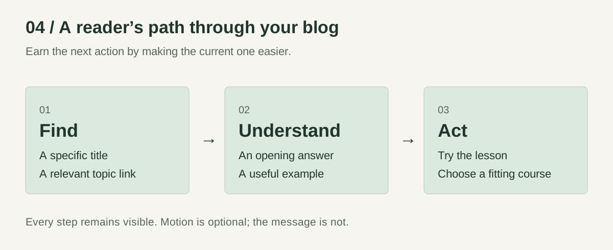
Good blog website design helps people find the right article, understand it comfortably, and take a useful next step. Typography, navigation, speed, accessibility, and content structure all contribute. A beautiful homepage is only part of the job.
This guide walks through a practical approach you can use whether you design in Figma, build with code, or publish through WordPress. You’ll find original wireframes, a worked example, an actionable launch checklist, and three Udemy learning paths matched to different needs.
Affiliate disclosure: This article contains Udemy affiliate links. If you buy through them, I may earn a commission at no extra cost to you. Course suggestions are based on the published curricula, not claims that I have completed or independently tested each course.
AI-generated editorial illustration. The diagrams below show the specific layout recommendations.
Start with the reader’s task
Before choosing a theme, finish this sentence:
This blog helps ___ do ___, and the most useful next step is ___.
For a beginner gardening blog: “This blog helps apartment dwellers grow herbs, and the most useful next step is choosing a first plant.” For a developer’s blog: “This blog helps frontend engineers solve implementation problems, and the next step is trying the example.”
Those answers change the design. A gardening reader needs clear photographs and seasonal context. A developer needs readable code, version information, and a working example. Both need a page that respects their attention.
Write down three real questions your audience asks. Use those questions to decide your initial categories, featured articles, and navigation labels. “Start a blog” tells a beginner more than “Resources.” “CSS layouts” tells a developer more than “Insights.”
Then choose one main business goal: course referrals, project enquiries, subscriptions, or something else. You can support several goals across a site, but every section does not need to ask for all of them.
Design three templates before polishing the homepage
Most small blogs can begin with three reusable templates. Add an About page and an easy-to-find contact route so readers can understand who is behind the work.
| Template | Reader’s question | What it should contain |
|---|---|---|
| Blog homepage | Is this publication for me? | A clear topic promise, a useful starting article, topic navigation, and recent posts |
| Category page | Where should I begin with this subject? | A short introduction, a recommended starting point, and a browsable article list |
| Article page | Can this help me solve my problem? | A specific title, direct introduction, author context, readable content, examples, and a relevant next step |
Design the article template first. A visitor arriving from a search result may never see your homepage. Their first impression is the reading experience.
A practical blog homepage layout
Use a compact header with the publication name, a few meaningful topics, and About or Contact. Add search when your archive is large enough that browsing alone becomes awkward.
Below it, explain the blog’s promise in a sentence. Feature one strong starting article, then give readers clear routes into your main subjects. A recent-post list can follow; your newest article is not automatically the best introduction to your work.
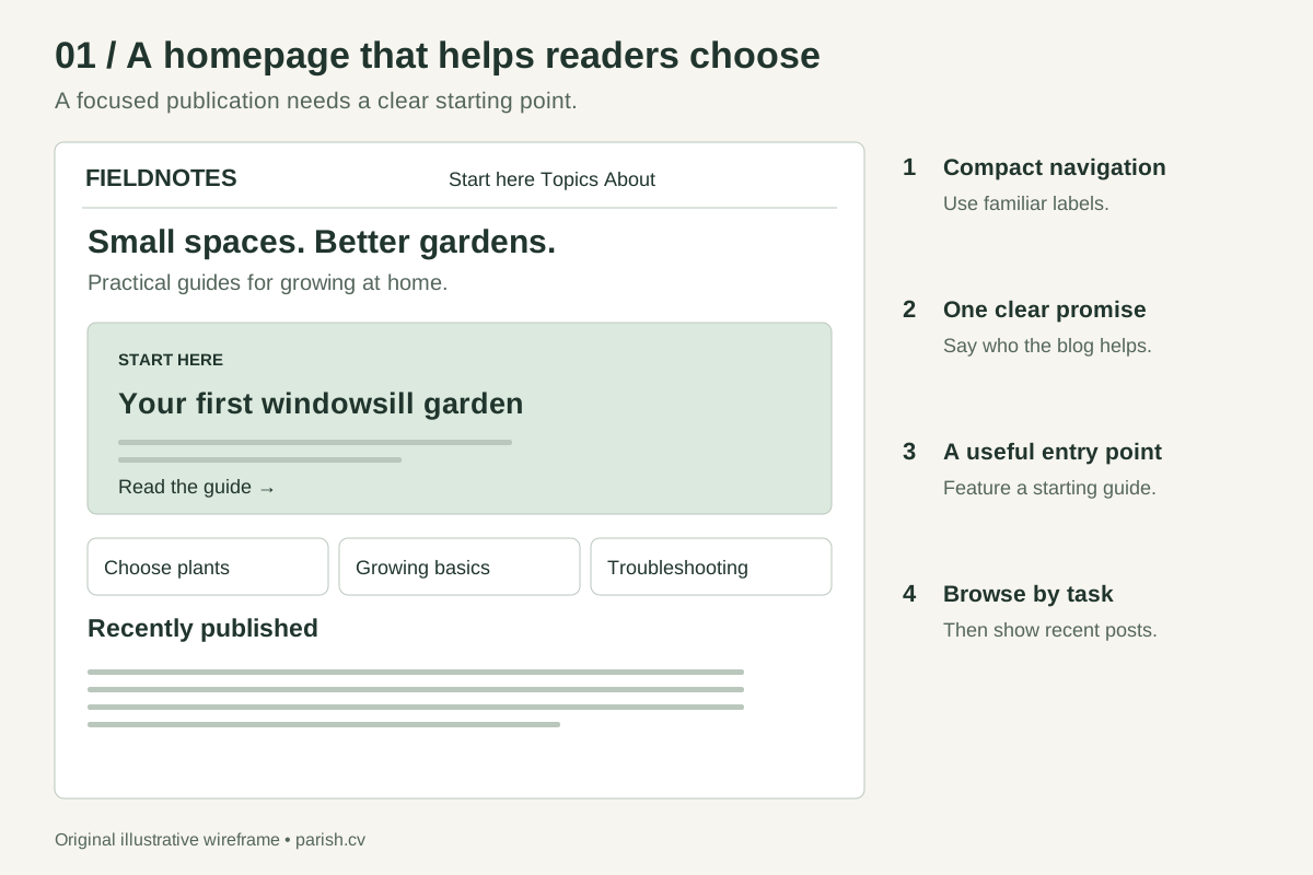
A starting structure for a focused publication. Replace the example labels with your readers’ actual tasks.
An article layout that gives the content room
Keep the title, author, and opening answer close together. An illustration can add context, but it should not push every useful sentence below a full screen of decoration.
For long guides, add a table of contents. On desktop, it can sit beside the article if space allows. On mobile, put a compact version near the introduction. Avoid turning it into a sticky panel that covers the paragraph someone is reading.
End with a next step related to the problem you just helped solve: an exercise, a deeper guide, a suitable course, or a project enquiry.
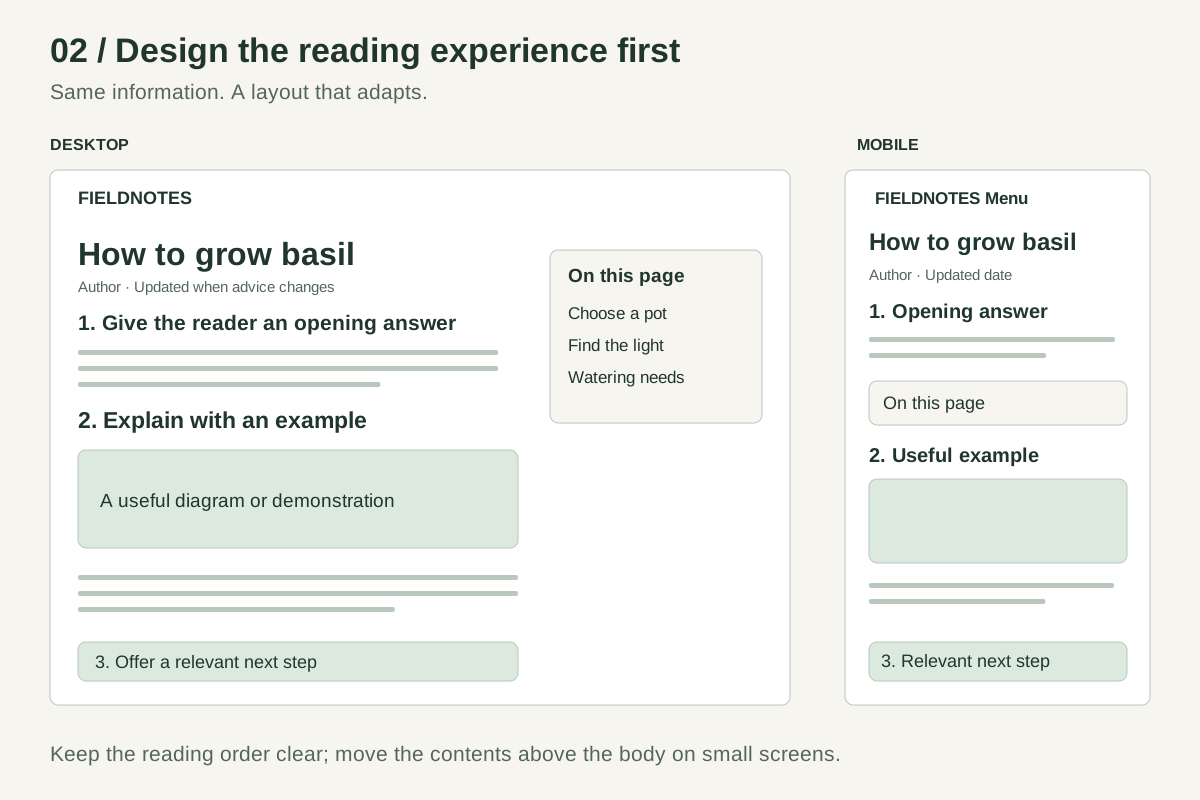
The mobile layout preserves the content and changes its arrangement. It is not a smaller desktop screenshot.
Make minimalist blog design useful, not empty
Minimalism works when the important things become easier to see. Removing navigation labels, hiding links behind ambiguous icons, or turning body text pale grey can make a page look quieter while making it harder to use.
Start with a restrained visual system: one body typeface, an optional heading typeface, a neutral background, dark text, and one accent colour for interactive elements. Use spacing to show which things belong together.
For the reading column, roughly 60–75 characters per line, body text around 18–20 pixels, and line height around 1.6–1.8 are useful starting points for many English-language articles. These are design suggestions, not Google ranking rules. Adjust them for the font, screen, and audience, then read several real paragraphs on a phone.
Distinguish headings through size and spacing. Underline inline links or give them another clear visual cue. Use descriptive link text, such as “compare the article layouts,” so the destination makes sense without guesswork.
Build accessibility into the template: logical headings, visible keyboard focus, labelled form fields, meaningful image alternatives, and sufficient colour contrast. Readers using assistive technology benefit from a well-structured page, too. The W3C page structure tutorial explains how regions and headings support navigation.
Match the layout to the content
| Blog style | Useful design emphasis | Common mistake |
|---|---|---|
| Personal essays | A calm reading column and clear archive | A large card grid that makes every essay look interchangeable |
| Tutorials and technical writing | Contents, steps, examples, and readable code | Code blocks that force the whole page to scroll sideways |
| Food, travel, or visual subjects | Purposeful photography with helpful captions | Huge images that delay the answer or instructions |
| Multi-author publication | Topics, search, bylines, and editorial consistency | Too many competing headlines above the fold |
A worked example: redesign a beginner gardening article
Imagine a fictional post called “How to Grow Basil on a Windowsill.” Its original template opens with a full-screen photograph, six sharing buttons, a product carousel, and a long personal introduction. The watering advice is difficult to find.
Here is a more useful design brief:
- Open with the problem. Explain what the article helps the reader do and what conditions it assumes.
- Offer clear routes. Use headings such as “Choose a pot,” “Find the right light,” and “Check watering needs.”
- Put pictures beside decisions. Show the drainage hole or planting step where the reader needs it.
- Make troubleshooting findable. Group symptoms under descriptive headings rather than burying them in the conclusion.
- Recommend something after establishing the need. Explain who would benefit from a course or product, and who would not.
The homepage could feature this as a starting guide. A “Small-space gardening” category could connect it to related articles. On mobile, the same content would flow in a single column.
This is a proposed redesign, not a measured case study. To evaluate it, ask someone unfamiliar with the page to locate a specific answer, find a related guide, and explain the recommended next step. Watch where they hesitate. That is more useful feedback than asking whether they “like the design.”
Build SEO into the blog’s structure
A well-designed blog makes useful content accessible to readers and search engines. It cannot guarantee a position in Google.
As checked on 24 September 2026, Google’s public ranking dashboard lists the August 2026 spam update, which began on 18 August, as its latest announced ranking update. The announcement is not a new design formula. Use the official update history to confirm announcements rather than relying on speculation.
Make every article worth arriving at
Answer the question implied by the title. Add something that makes the explanation useful: your own diagram, a worked example, implementation detail, a comparison with clear criteria, or evidence from actual testing when you have it.
Identify the author and cite sources for claims readers may need to verify. Update advice when the underlying facts change; do not change dates merely to make old material look fresh. Google’s people-first content guidance emphasises usefulness, reliability, and satisfying the reader’s needs.
Make pages easy to discover and understand
Give each article a descriptive title and a stable URL. Link to it from relevant category pages and related articles. Use a logical heading structure, descriptive image alternatives, and internal links that explain their destination.
Write a distinct meta description that accurately previews the page. Think of it as a useful summary, not a place to repeat every keyword variation. Google may choose different text for the search snippet. Its SEO Starter Guide covers these basics.
Developers should also check that important pages return successful responses, are not accidentally marked noindex, and can be crawled. Verify canonical URLs and sitemap entries. If a redesign changes existing URLs, plan redirects before launch. Use Search Console’s URL Inspection to investigate what Google can access rather than assuming that a page working in your browser proves it is indexed.
Keep affiliate recommendations useful and transparent
Google’s spam policies distinguish useful affiliate content from thin pages that repeat merchant descriptions without adding value. They also address keyword stuffing, link spam, and scaled content created to manipulate rankings.
For a blog, the practical approach is straightforward: explain the decision, compare relevant options, disclose the commercial relationship, and avoid invented experience or results. Do not buy links for ranking credit or publish near-identical articles for every keyword variation.
Mark paid links with rel="sponsored"; nofollow can also be used alongside it. Google documents this in its outbound link guidance. A visible affiliate disclosure and a technical link attribute serve different purposes; use both.
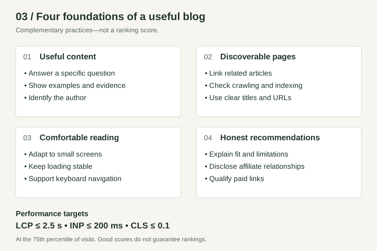
These are complementary practices, not a points system or a ranking guarantee.
Make the page fast, stable, and comfortable on mobile
A blog can look simple and still load too much JavaScript, oversized photography, advertising code, and third-party widgets. Judge the delivered page, not just the mockup.
Google’s Core Web Vitals cover loading, responsiveness, and visual stability. The “good” thresholds are LCP at or below 2.5 seconds, INP at or below 200 milliseconds, and CLS at or below 0.1, assessed at the 75th percentile of visits. See the Web Vitals guidance.
For a content-heavy site, start with the obvious sources of friction:
- Serve appropriately sized images in efficient formats. Give images dimensions so the browser can reserve their space.
- Lazy-load images below the initial viewport; avoid delaying an important above-the-fold image with lazy loading.
- Limit font files, embeds, and scripts that do little for the reader.
- Reserve space for adverts and other content that arrives late.
- Let code blocks and wide tables scroll within their own containers.
- Keep mobile navigation usable without covering the article.
Use PageSpeed Insights to find issues, but distinguish lab diagnostics from real-user data. A new or low-traffic site may not have enough field data. Good scores support the experience; they do not guarantee top rankings, as Google explains in its page experience guidance.
Motion should explain something. A short transition showing how a desktop layout becomes a mobile layout can teach; paragraphs that fade in only after scrolling can get in the way. Respect reduced-motion preferences, and keep the content understandable without animation.
The animation runs once, then stops. Its static version communicates the same idea.
Choose a platform you can keep publishing with
The right platform depends on your workflow and maintenance capacity, not on a promise that one technology automatically ranks better.
| Approach | Consider it when | Plan for |
|---|---|---|
| WordPress | You want a familiar editorial interface and an extensible publishing system | Hosting, backups, updates, and careful theme/plugin selection |
| Hosted publishing platform | You prefer a managed publishing workflow | Current plan limits, design control, export options, and recurring costs |
| Custom site with a CMS | You need a distinctive experience or integrations | Development, a usable editing workflow, maintenance, and preview/publishing tools |
| Static or Markdown-based blog | Your team is comfortable with a repository and build workflow | How nontechnical contributors will draft, preview, and publish |
Before committing, publish a sample article with an image, a table, a long title, and a related link. Preview it on mobile. If ordinary editing feels fragile, solve that problem before adding more design features.
Three Udemy courses for three different starting points
Choose the course that addresses your current bottleneck. You do not need to buy all three to build a blog.
These suggestions were selected by comparing Udemy’s published learning outcomes with the skills in this guide. They are curriculum-based recommendations, not hands-on course reviews. Check the preview lessons, recent student feedback, current syllabus, and checkout price before enrolling; prices and availability can change.
| Your immediate goal | Course and instructor | Why it fits | Main limitation for this project |
|---|---|---|---|
| Design a layout and test a prototype | Figma UI UX Design Essentials — Daniel Walter Scott | Covers wireframes, visual design, components, and interactive prototypes | Design training does not replace building and launching the site |
| Build the responsive interface yourself | Build Responsive Real-World Websites with HTML and CSS — Jonas Schmedtmann | Covers semantic HTML, CSS layouts, responsive design, and website planning | HTML and CSS alone do not provide a CMS or editorial workflow |
| Start publishing without learning to code first | Wordpress for Beginners – Master Wordpress Quickly — Andrew Williams | Covers WordPress setup, the dashboard, pages, posts, and the block editor | You still need to make content, theme, hosting, and maintenance decisions |
All course links in this section are affiliate links.
For designers: turn the wireframe into a testable prototype
If you can recognise a good layout but struggle to construct one, the Figma course is the most relevant starting point here. Its published syllabus includes wireframing, typography, reusable interface elements, and prototyping.
Your practice project: build the homepage and article wireframes from this guide in Figma. Use a real headline and several paragraphs, then test how a reader reaches the article from a category page. Do not judge the design using placeholder text alone.
Preview Daniel Walter Scott’s Figma course on Udemy →
For developers: build one excellent article template
If layout implementation is your gap, Jonas Schmedtmann’s HTML and CSS course covers the foundations you will use repeatedly, including Flexbox, Grid, and responsive design. The listing showed a November 2024 update when checked; treat it as foundational training rather than a guide to every newest browser feature.
Your practice project: implement an article with a long title, image, table, code block, and mobile contents section. Test narrow screens and keyboard navigation before adding decorative motion. If you already build accessible responsive layouts confidently, this course may be too introductory.
Explore the HTML and CSS curriculum on Udemy →
For bloggers: get comfortable with the publishing workflow
If your main obstacle is turning a draft into a live article, Andrew Williams’s WordPress course is the most direct fit of these three. Its listing covers working with pages and posts, using the editor, and learning through a local installation.
Your practice project: publish a sample post locally, assign a meaningful category, add descriptive image text, and preview the result on mobile. Practise revising an existing article as well as creating a new one.
See the WordPress beginner course on Udemy →
A blog design checklist you can actually use
Before launch, walk through a real article as a new visitor would:
- Can I tell who the article is for and what it will help me do?
- Is a useful explanation visible near the beginning?
- Can I find the author, the relevant sources, and a contact route?
- Can I navigate by keyboard and read comfortably on a small screen?
- Do headings, links, diagrams, and image alternatives make sense?
- Do images and embeds stay in place while the page loads?
- Are the title, URL, description, canonical, and indexing settings correct?
- Can I reach this article through relevant links elsewhere on the site?
- Are commercial recommendations disclosed and affiliate links qualified?
- Does the next step follow naturally from the article?
After launch, check indexing and query performance in Search Console. Track course-link clicks and project enquiries separately; a click is not a sale. Use affiliate reporting to understand attributed purchases. Compare periods with enough data to be meaningful, and investigate technical problems before blaming every change on an algorithm update.
Want a professional developer to build your blog?
A course is a useful route when you want to learn the work yourself. If you would rather focus on writing and your business, I can help with the build.
I’m Parish Khan, a professional full-stack developer. I build web experiences with an emphasis on clear UI, responsive behaviour, performance, and maintainable implementation. For a blog project, we can define a minimalist design around your content, connect a practical publishing workflow, and address the technical SEO foundations that help search engines access and understand your pages.
The aim is a blog readers enjoy using and that gives your content a sound foundation for search. Rankings still depend on the content, competition, and other factors beyond the build.
Tell me about your blog project →
Send your topic, a link to any existing site, your preferred publishing workflow, and the main action you want readers to take. You can also explore my technical SEO services and website speed optimisation services.
Common questions about blog website design
What is the best layout for a blog?
For most text-led blogs, start with a single main reading column, clear headings, useful topic navigation, and a relevant next step. Add supporting columns or visual grids when the content justifies them. The best layout is the one that makes your readers’ actual tasks easier.
Does minimalist design help SEO?
Minimalism is not a ranking factor on its own. It can help you create a less distracting, faster, easier-to-use page, but only if you preserve useful content, navigation, accessibility, and technical fundamentals.
Do I need to code to create a blog?
No. A CMS such as WordPress can support publishing without writing the site’s code yourself. Coding skills become useful when you want deeper control, custom interactions, or integrations beyond what your chosen setup provides.
How long should a blog post be for SEO?
Long enough to answer its intended question well. Google’s people-first content guidance explicitly rejects the idea of a preferred word count. Remove repetition and add detail where it helps a reader make a decision or complete a task.
Should I redesign my whole blog before publishing?
You can start with a reliable article template, straightforward navigation, and a manageable publishing workflow. Fix barriers to reading, accessibility, or indexing first. Then use real reader feedback to decide what deserves more design work.